I have always been a minimalist. Less is more is my all-time favourite. Some people prefer colourful rooms for their children, but I’ve always had it minimalistic and simple, letting toys add warmth and colour.
As you may have already noticed, we, designers, like minimalism and are therefore using colours sparingly.
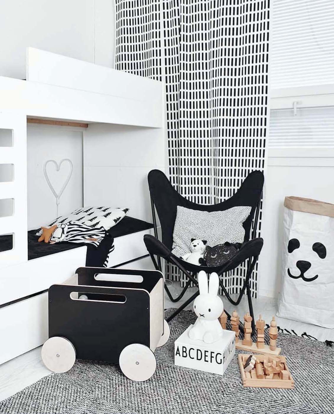
Black is my favourite. I love bold accents and bold statements. How else could one make them than by adding a bold print, a black toy chest or a dark linen bedding? Black makes a visual focus, a balance and a contrast. It makes a point.
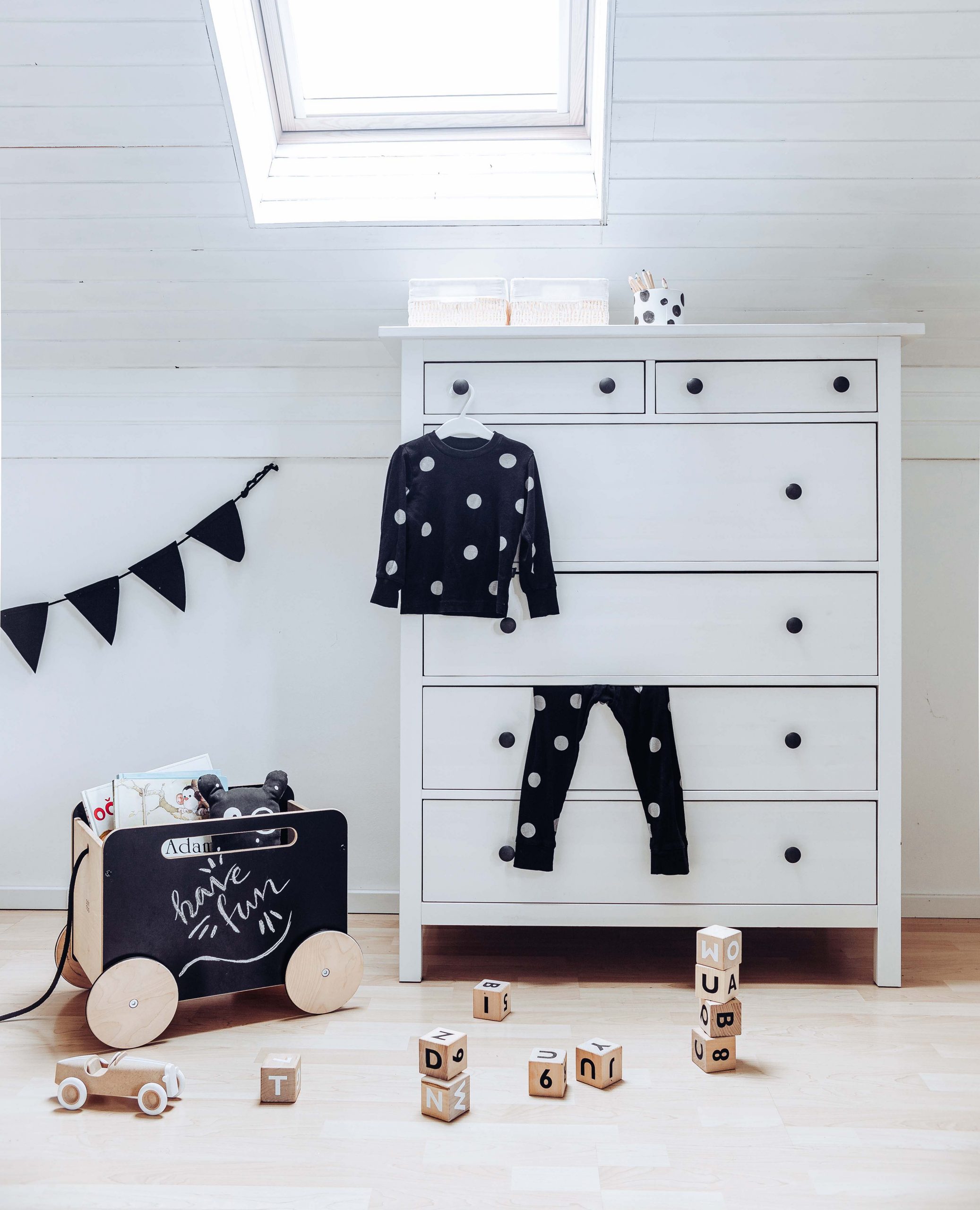
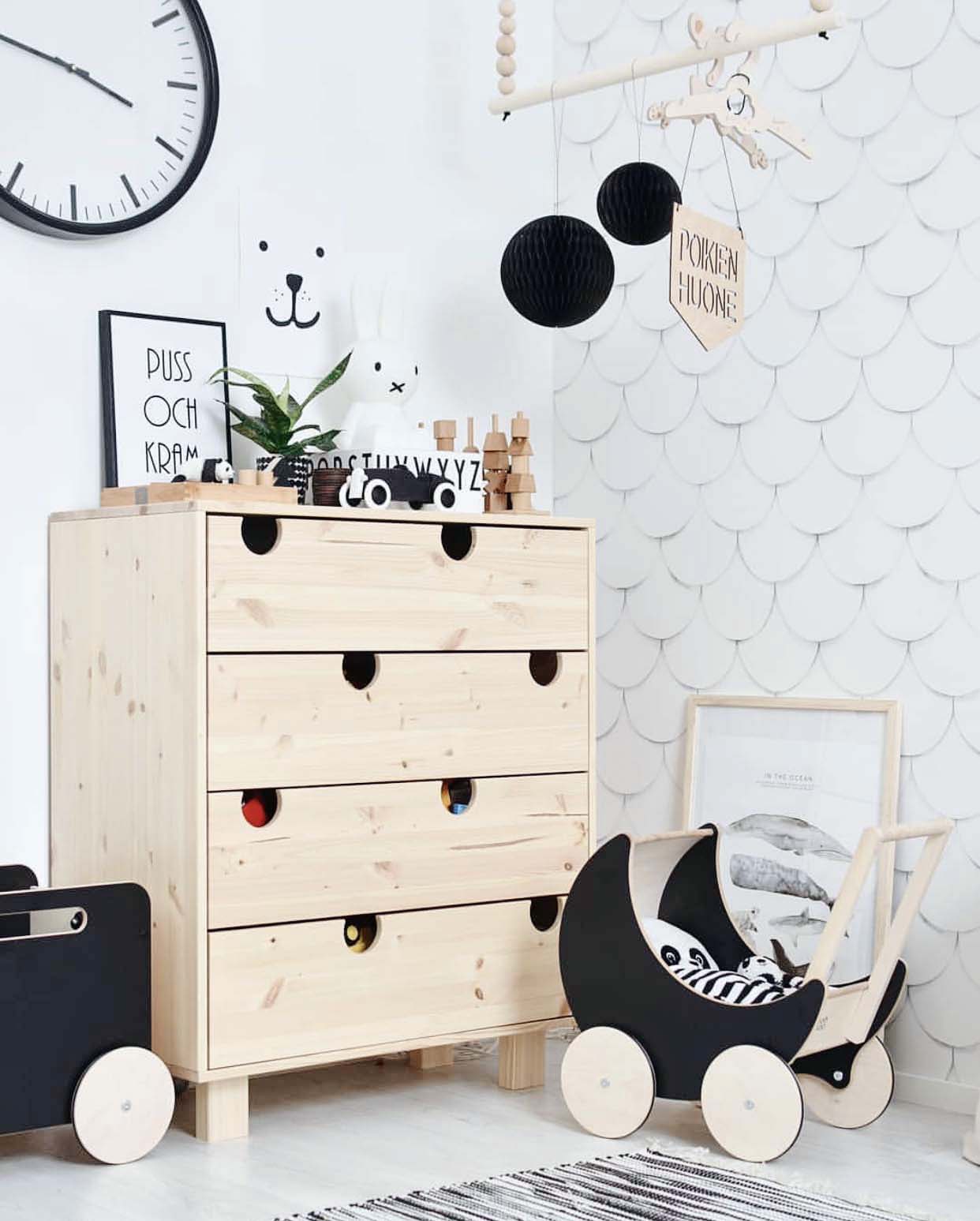
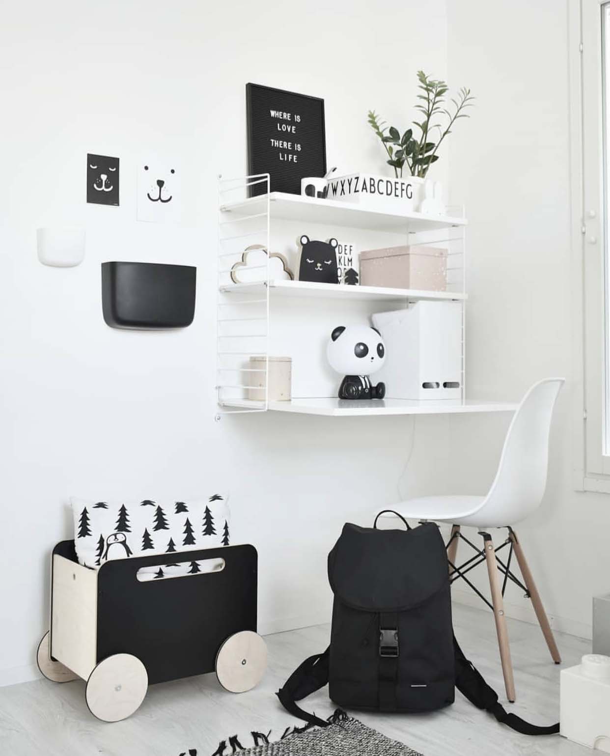
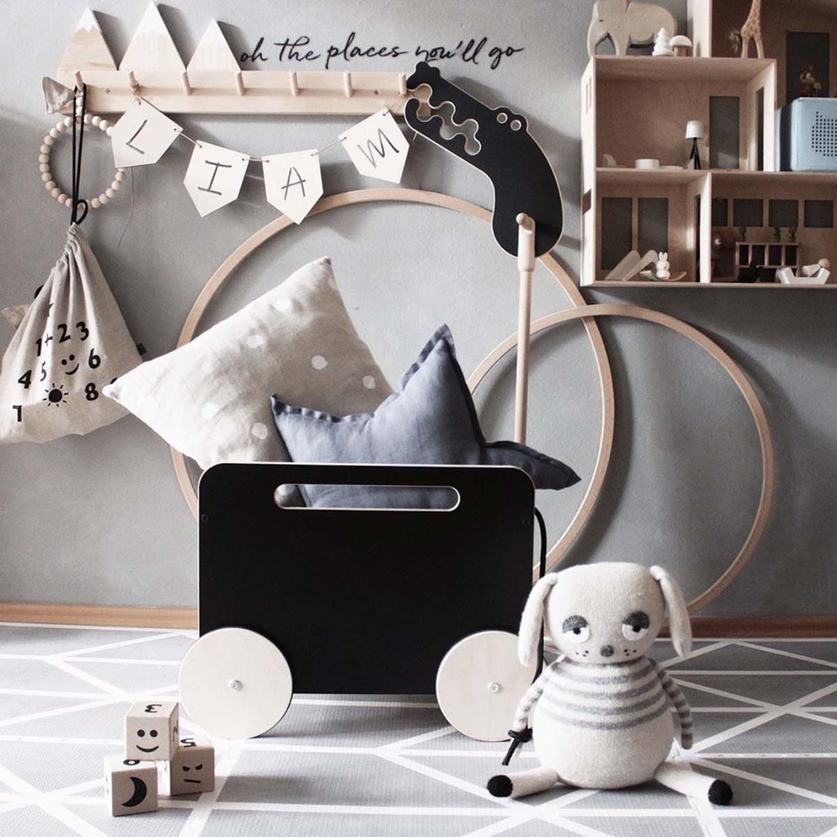
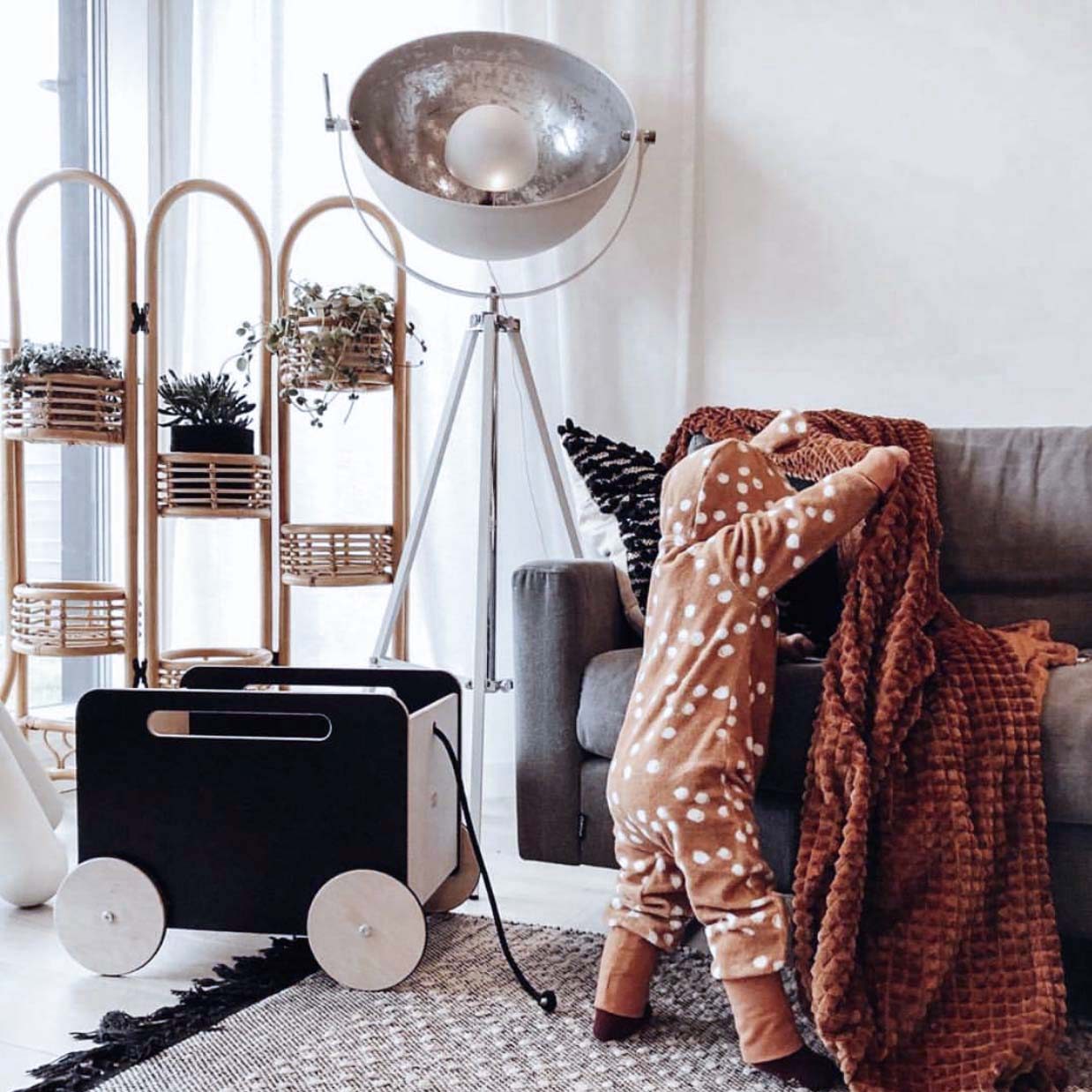
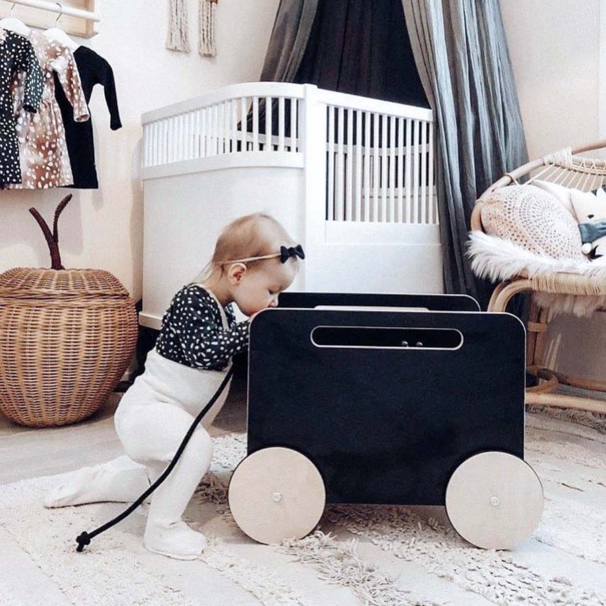
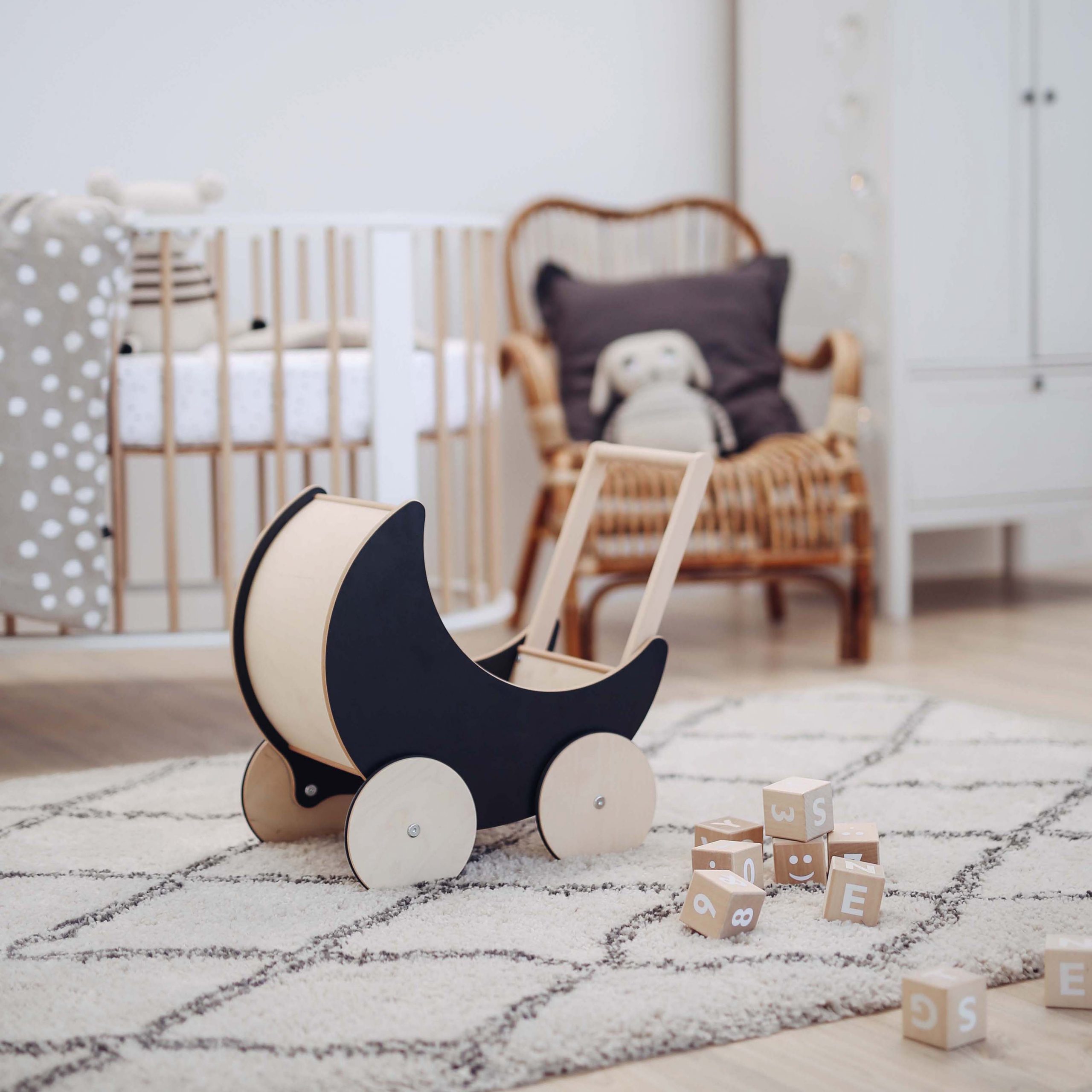
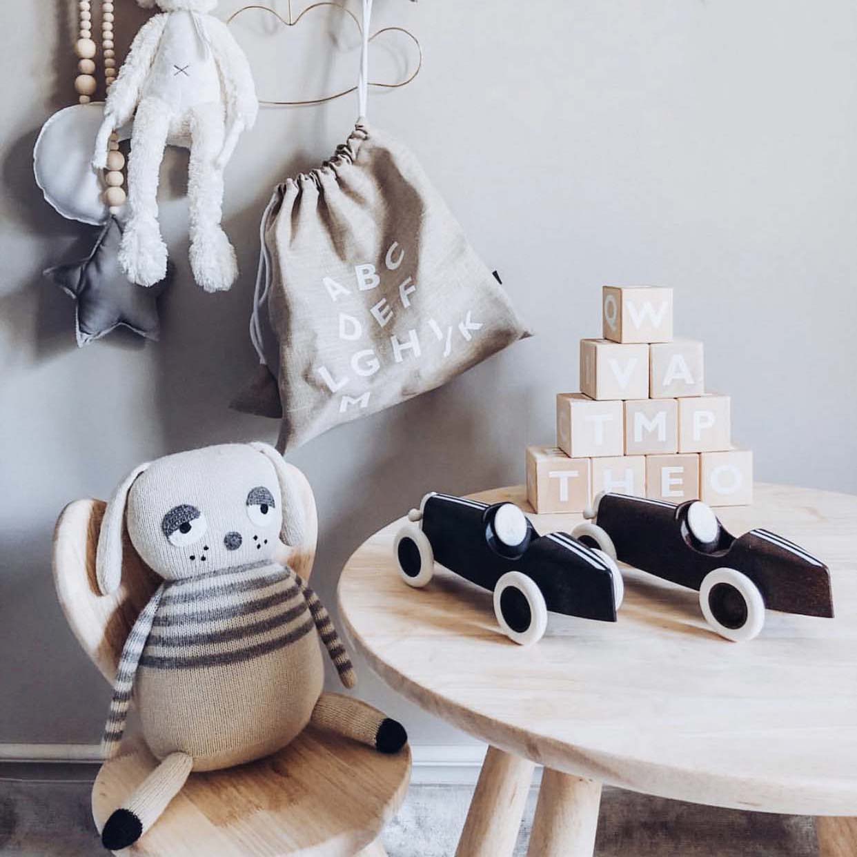
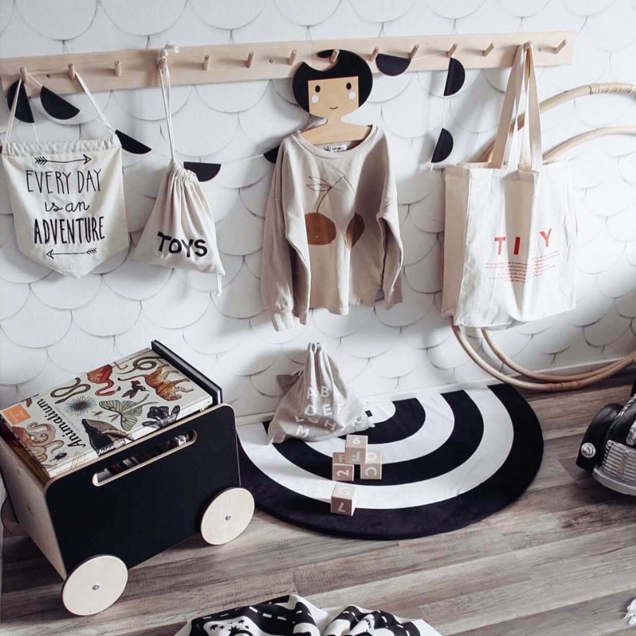
On the photos above we love how black toy chests add contrast to otherwise fairly light rooms. Light floor and light walls make the interior fresh and bright and dark items catch your eye’s attention.
I just love it! Personally, I am a graphic pattern lover too, but will come to graphic patterns another time.
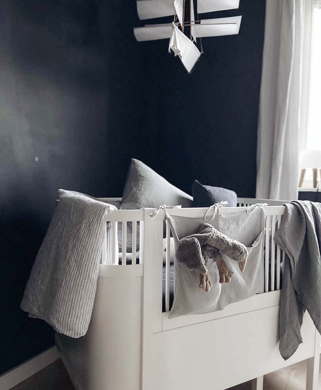
I DO ADMIT, I absolutely love seeing a black wall in a child’s bedroom. One is enough, though! We don’t want to make it too dark. Especially if it’s not a big room.
For example, this nursery of @inblckandwht is a great example of classy contrasts. A black and white room never goes out of style, if you ask me.
I love it even more when a wall is a blackboard. What makes more fun than having a whole wall you can draw on or play teachers and students with it (that is what my daughter loves ?)!
If an interior is fairly light with some wooden furniture to add some warmth, black will give it a contrast. It will make a visual point.
If you still aren’t sure if painting a wall black might be a step too bold for you, you can add an anthracite bedding which also leaves an impression. The bedding presents a large area in the room, so you can experiment with the bedding first. It’s easy to change it if you feel it’s too dark.
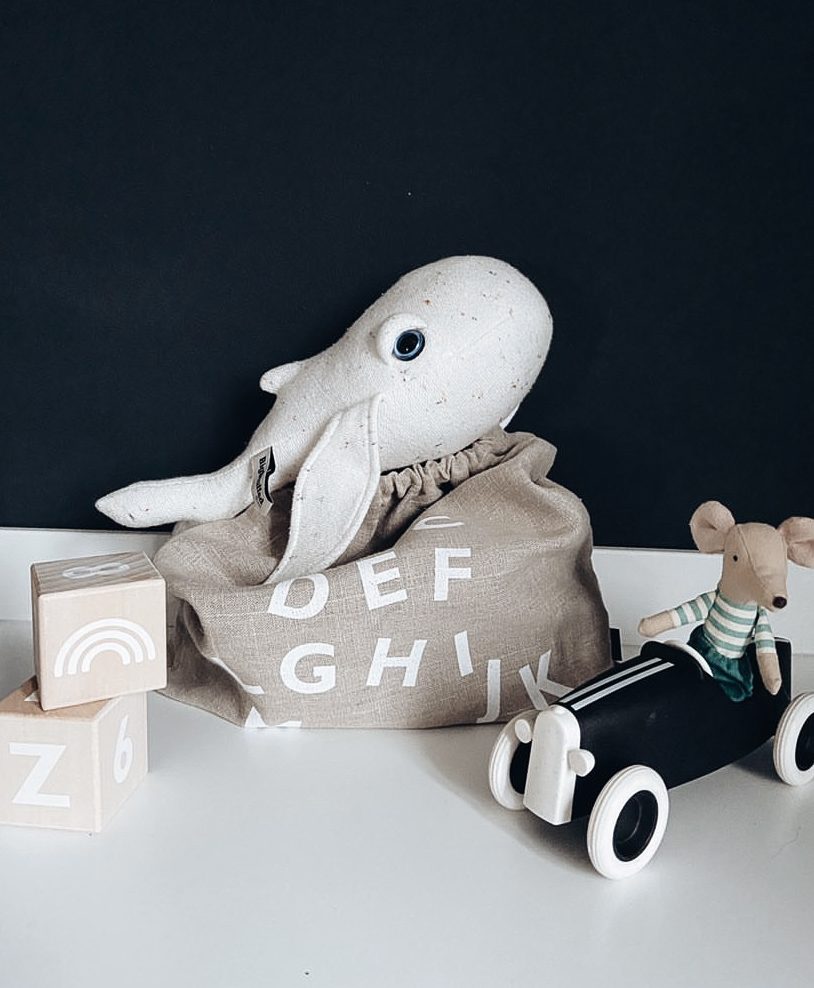
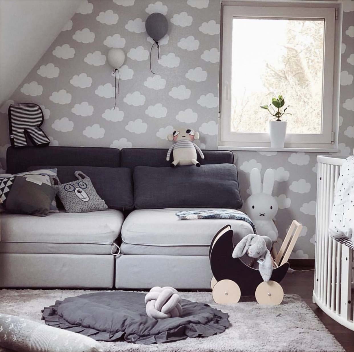
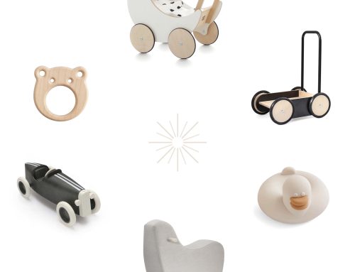
Sometimes just little accents like Mr. Crocodile sticking out of a paper bag, a black toy chest or a toy pram can be enough to make a point.
@moa.nyberg and @my_favourite_life_ made some visual connections with other items in dark or black, for example a carpet or some cushions on the sofa. They make an interesting journey for your eye.
@tiinayli made such an impression on me with this photo of her baby on the dark grey sheep skin.
It’s simply #cutenessoverload, isn’t it? ?
All in all, I think black is bold. Black is classy and a black detail in a child’s bedroom is saying: I dare! I dare to be bold.

